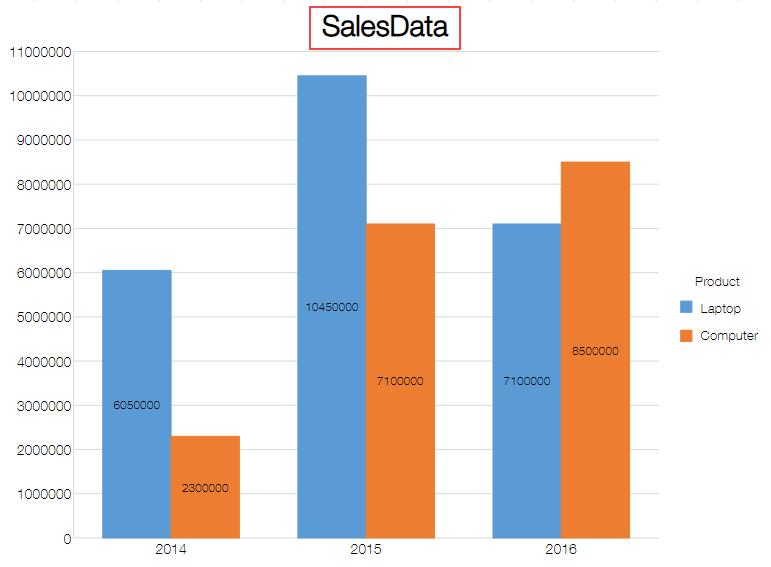
You can display a chart title to make it easy to understand the chart content. Follow the steps shown in the image below to add a chart title. To hide the chart title, select None from the Chart Title.
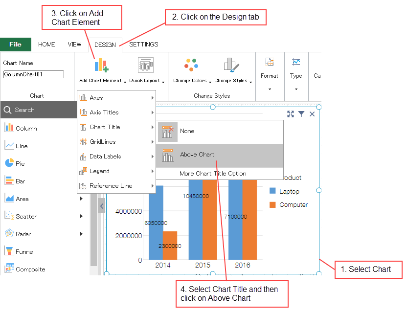
This topic discusses the steps to create a chart.

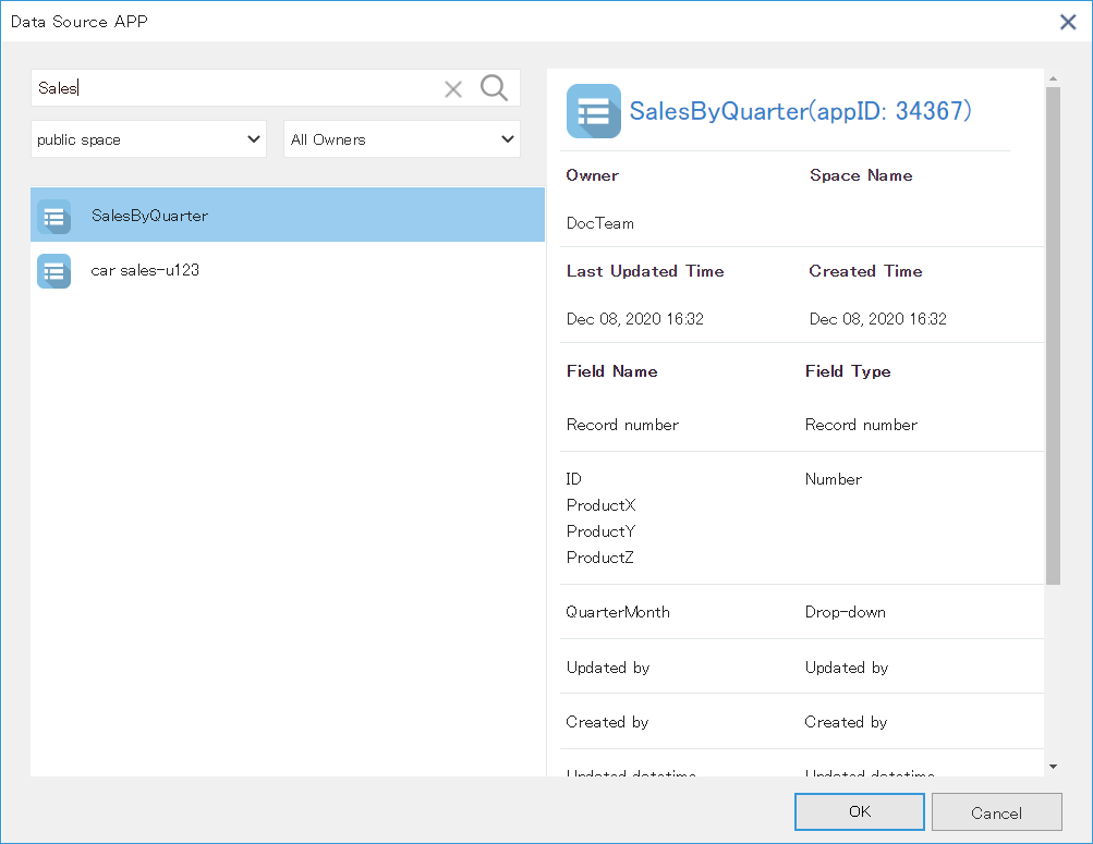
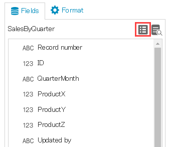
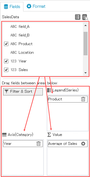
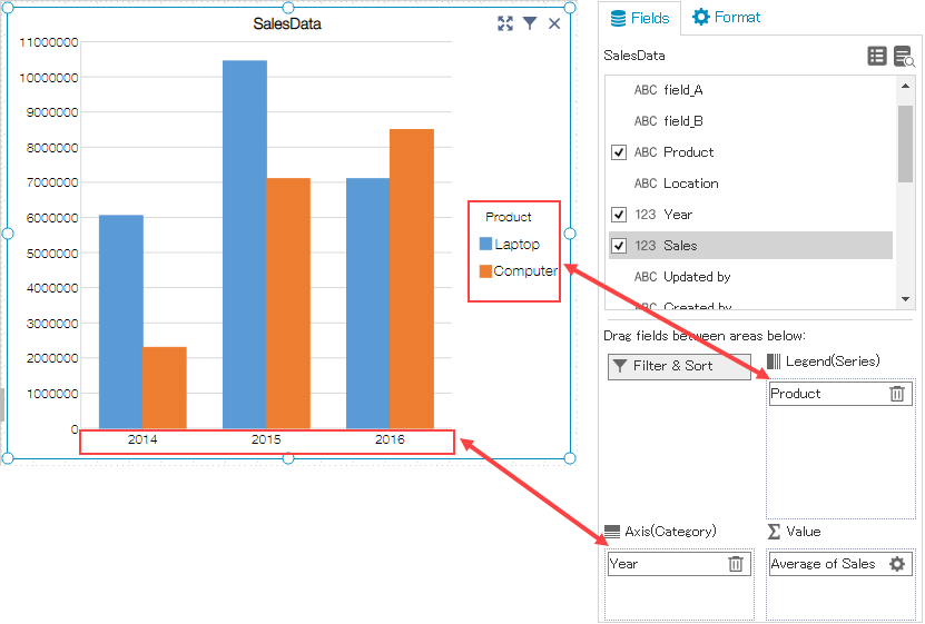
You can also set various elements of the chart. Below section discusses the chart elements and how to set them on chart.
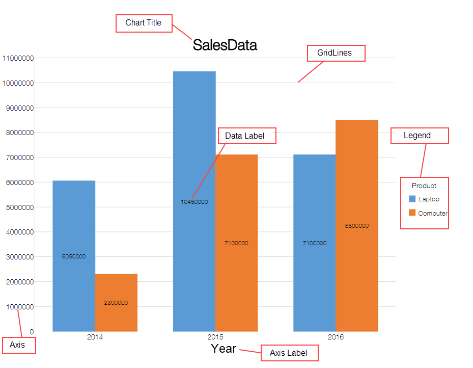

You can display a chart title to make it easy to understand the chart content. Follow the steps shown in the image below to add a chart title. To hide the chart title, select None from the Chart Title.

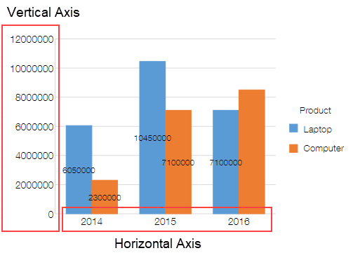
Make a chart easier to analyze by setting the vertical or horizontal numeric values or by changing the settings of category axis. You can display or hide the axes by following the steps shown in the image below.
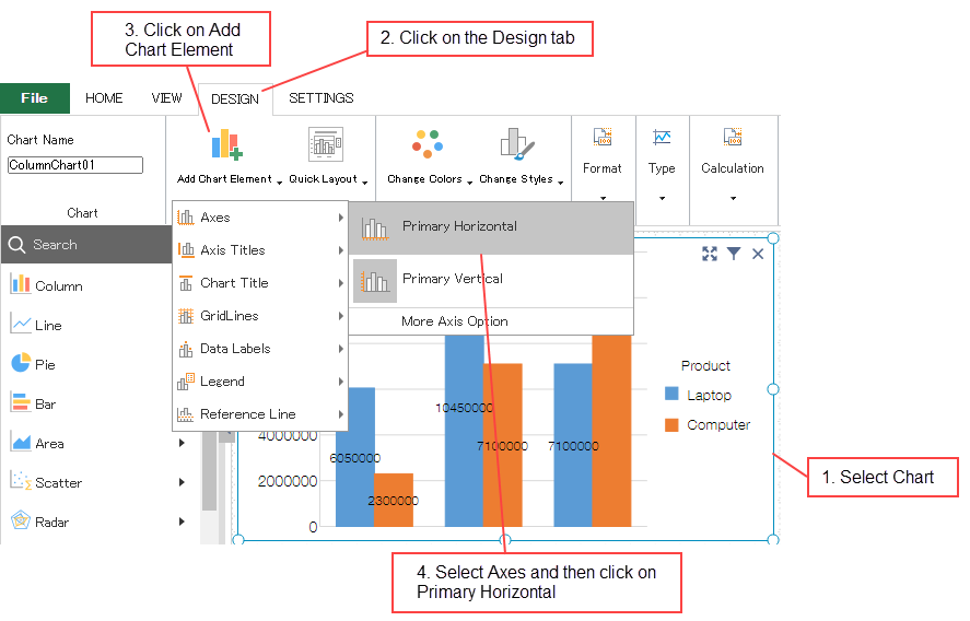
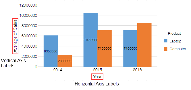
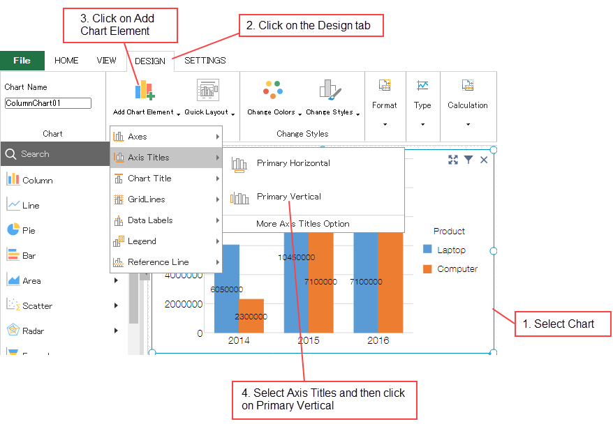
Convey the content displayed on the vertical value axis and the horizontal category axis properly by using the axis labels. You can display axis labels by following the steps below.
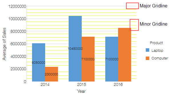
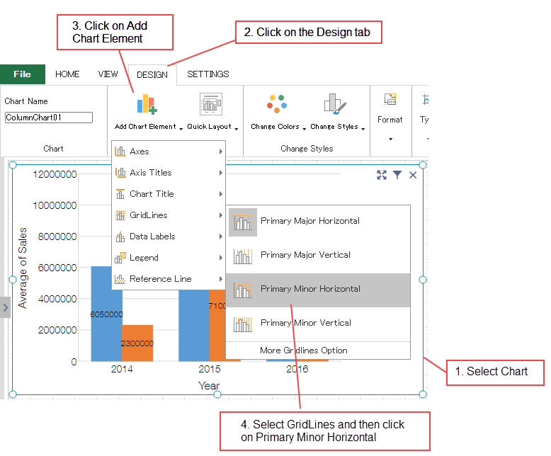
To make the height of bar chart etc. visually easier to understand, you can choose to display the grid lines. Follow the steps below to add the grid lines.
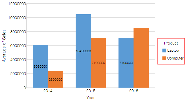
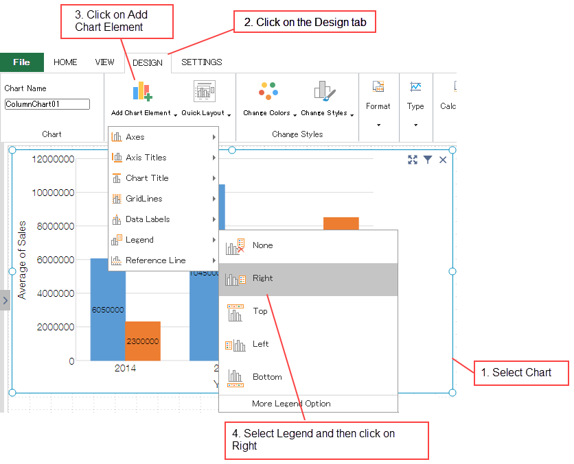
Legend gets displayed in the chart if a field is set in the Legend of Fields area. You can change the position of legend or can even hide it.
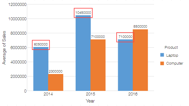
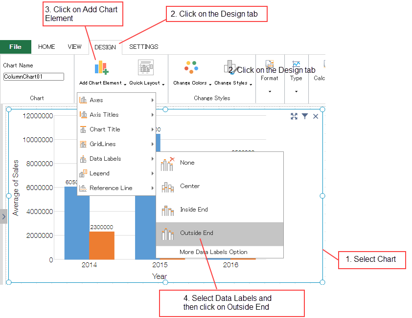
You can display the data labels to make it easier to read the chart content. Follow the steps below to add data labels on a chart.
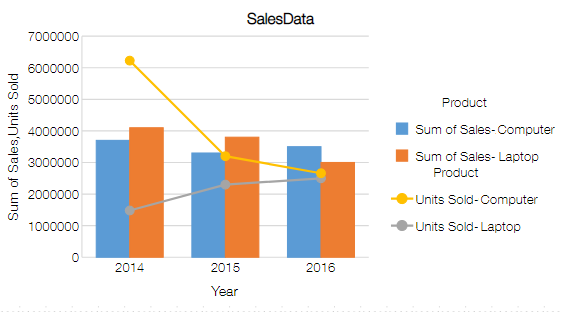
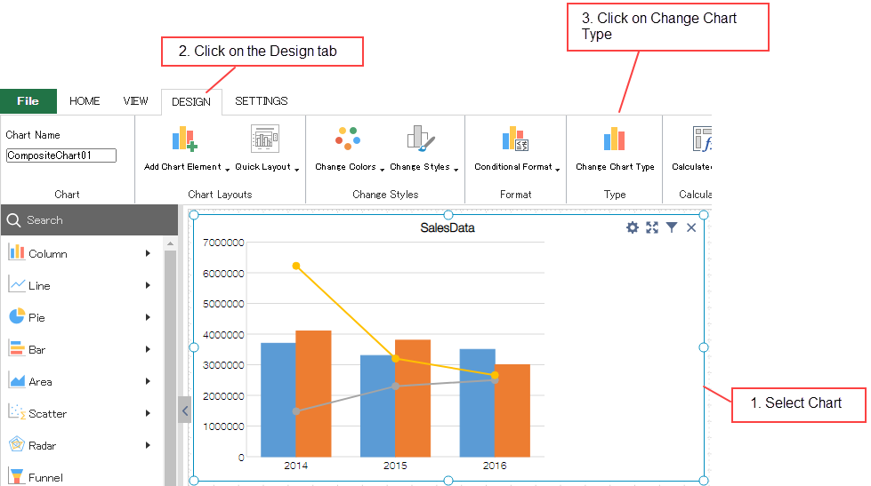
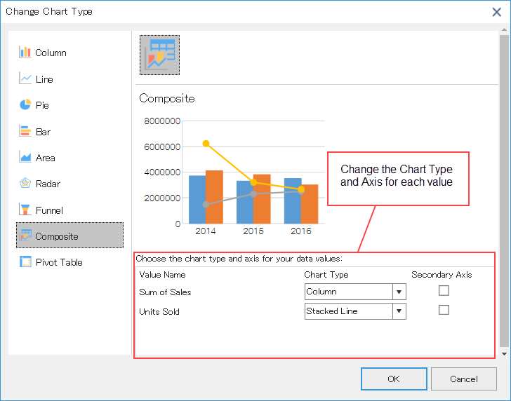
Composite charts can be displayed by using different chart types such as column, line chart etc. to display different types of information. Follow the steps given below to create a composite chart.
You can set chart formatting in the Format area. Select chart element to be formatted from the dropdown.
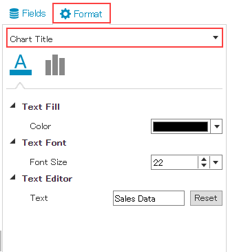
krewDashboard provides following settings to format the chart elements.
| Chart Element | Setting | Remarks |
|---|---|---|
| Chart Area | Fill | Set back color of the whole chart |
| Width | ||
| Height | ||
| Text Fill (Color) | Set font color for the whole chart | |
| Text Font (Font Size) | Set font size for the whole chart | |
| Is Smooth Line | Specify whether to have curved line or not, available only in Line or Area chart | |
| Opacity | Specify transparency of the fill, available only in Area, Scatter, Bubble, Filled Radar charts only | |
| Show Symbol | Available in Line, Area, Radar, Filled Radar charts only | |
| Symbol Size | Available in Line, Area, Bubble, Radar, Filled Radar charts only | |
| Empty Cell Options | Available in Line, Area, Radar, Filled Radar charts only | |
| Clipping mode | Specify whether to draw chart categories outside the plot area, available in Scatter, Bubble charts only | |
| Drill Down | ||
| Value Transpose Setting | Available in Radar chart only (Data Conversion in Radar Chart) | |
| Chart Title | Display/Hide the chart title | Set using Add Chart Element of ribbon menu |
| Text Fill (Color) | ||
| Text Font (Font Size) | ||
| Title | Set any text | |
| Horizontal Alignment | ||
| Horizontal (Value) Axis | Display/Hide Axis | Set using Add Chart Element of ribbon menu |
| Line (Color) | ||
| Line (Width) | ||
| Text Fill (Color) | ||
| Text Font (Font Size) | ||
| Units Major | ||
| Units Minor | ||
| Maximum | ||
| Minimum | ||
| Display Unit | ||
| Values in reverse order | Available in Radar and Filled Radar charts only | |
| Tick Marks (Major type) | Specify how to display ticks on the axis | |
| Tick Marks (Minor type) | Specify how to display ticks on the axis | |
| Vertical (Category) Axis | Display/Hide Axis | Set using Add Chart Element of ribbon menu |
| Line (Width) | ||
| Text Fill (Color) | ||
| Text Font (Font Size) | ||
| Tick Marks (Major type) | Specify how to display ticks on the axis | |
| Tick Marks (Minor type) | Specify how to display ticks on the axis | |
| Alignment | ||
| Axis Title | Display/Hide Axis Title | Set using Add Chart Element of ribbon menu |
| Text Fill (Color) | ||
| Text Font (Font Size) | ||
| Text Editor (Text) | Set any text | |
| Major GridLines/Minor GridLines | Display/Hide GridLines | Set using Add Chart Element of ribbon menu |
| Line (Color) | ||
| Line (Width) | ||
| Legend | Display/Hide Legend | Set using Add Chart Element of ribbon menu |
| Text Fill (Color) | ||
| Text Font (Font Size) | ||
| Show Series Text | ||
| Series Text (Text) | Set any text | |
| Legend Position | ||
| Show size legend | Available in bubble chart only | |
| Size Icon Color | Available in bubble chart only | |
| Data Labels | Hide/Display Data Labels | Set using Add Chart Element of ribbon menu |
| Fill | ||
| Text Fill (Color) | ||
| Text Font (Font Size) | ||
| Label Position | ||
| Label Contains | Specify the content to display such as value, series name etc. | |
| Overlap | Specify whether to overlap the data labels. | |
| Conditional Format | For information about conditional formatting of each element of chart, see Conditional Formatting of Chart | |
| Reference Line | For information about reference line, see Reference Line | |