| Setting | Description | ||||||||||||||||||
|---|---|---|---|---|---|---|---|---|---|---|---|---|---|---|---|---|---|---|---|
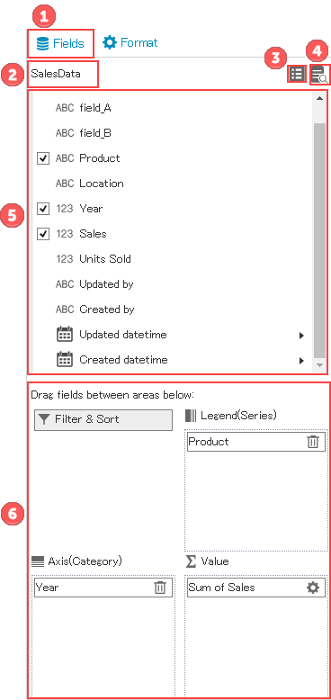
| 1 | Tab to switch between Field settings and Format settings. | ||||||||||||||||||
| 2 | Displays the selected app name. | ||||||||||||||||||
| 3 | Click this icon to display the app selection dialog and to change the selected app.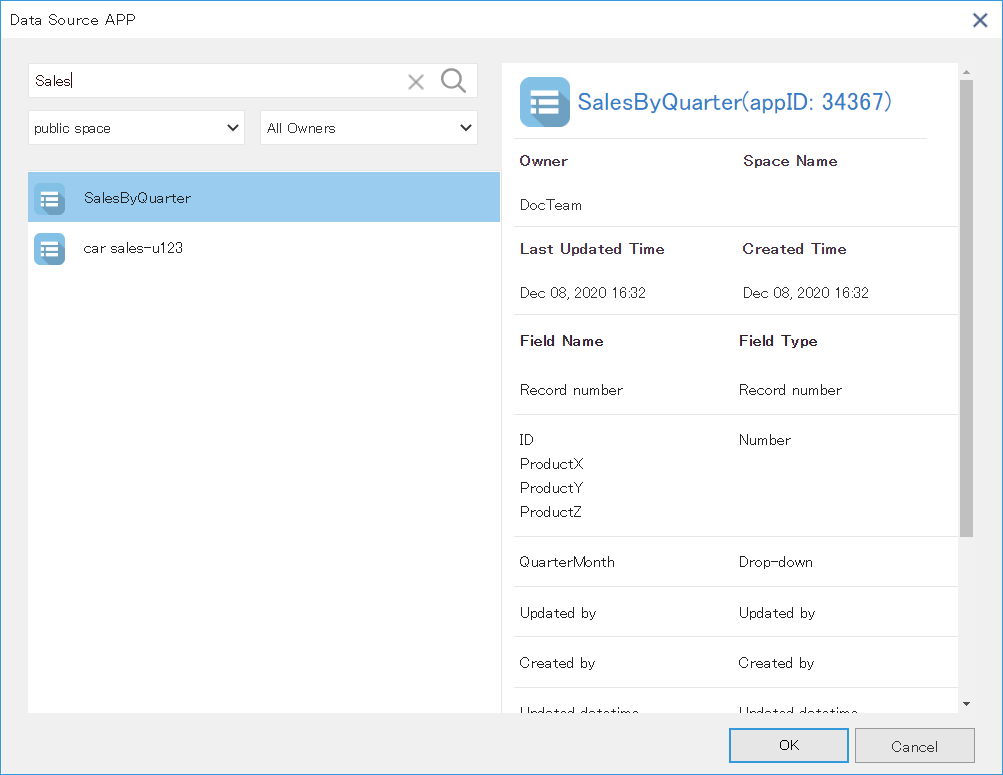 | ||||||||||||||||||
| 4 | Click this icon to display data of the selected app. Maximum 500 data records can be displayed. | ||||||||||||||||||
| 5 | Displays fields of the selected app. Icon on left of the field name and purpose of the field depends on field type of the kintone app.
| ||||||||||||||||||
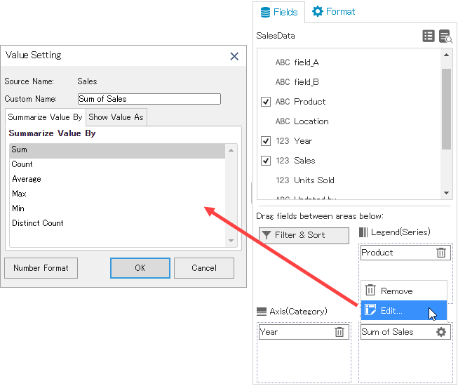
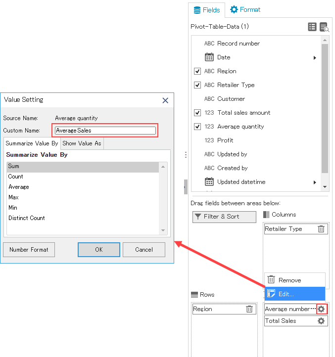
| 6 | Drag the fields you want to visualize to the Axis(Category), Legend(Series), and Value. The data is aggregated by grouping it by the fields used in Axis and Legend.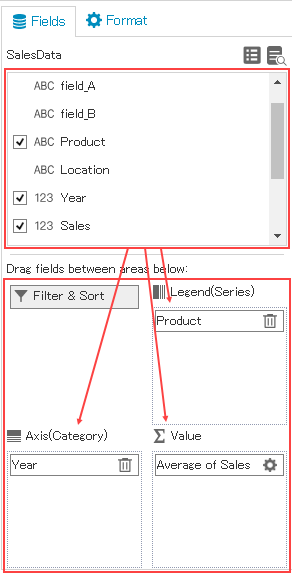 Axis(Category) and Legend(Series) work in conjunction with the chart. 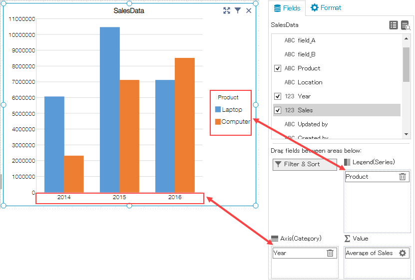 Similarly, pivot tables work in conjunction with rows and columns. 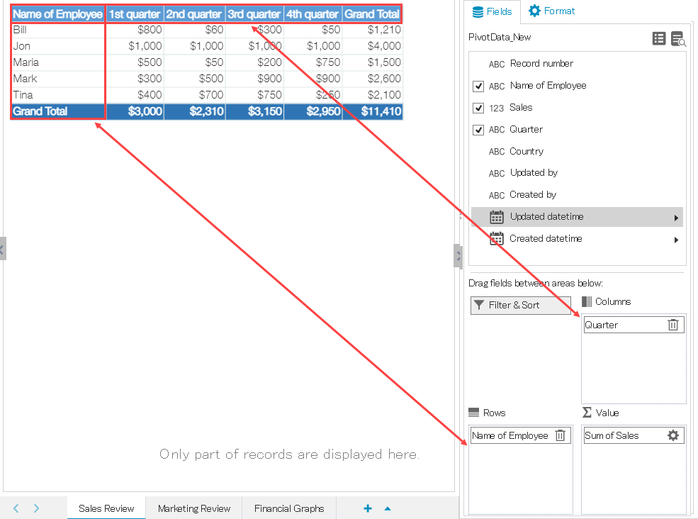 You can sort or filter the data by clicking the filter button. For more information, see the topic below. |