Display Records
In This Topic
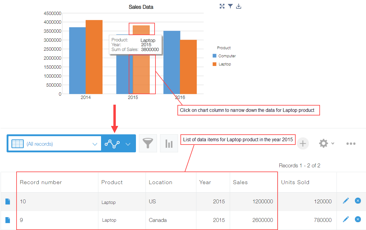
On clicking the chart (or double clicking the pivot table), a filtered list of corresponding records of kintone app gets displayed.
This feature is especially useful to understand which records are included in aggregation result.

- Default list of kintone app referenced by the chart is displayed.
- In case of gauge and number chart, the filtered list is displayed on clicking the numeric value.
- If you are using date fields on axis (example: year/month, year/month/day), you can filter down the data to display a list based on the selected date in the kintone app.
See Also